EMBER
& OAK
BRAND IDENTITY / DIGITAL EXPERIENCE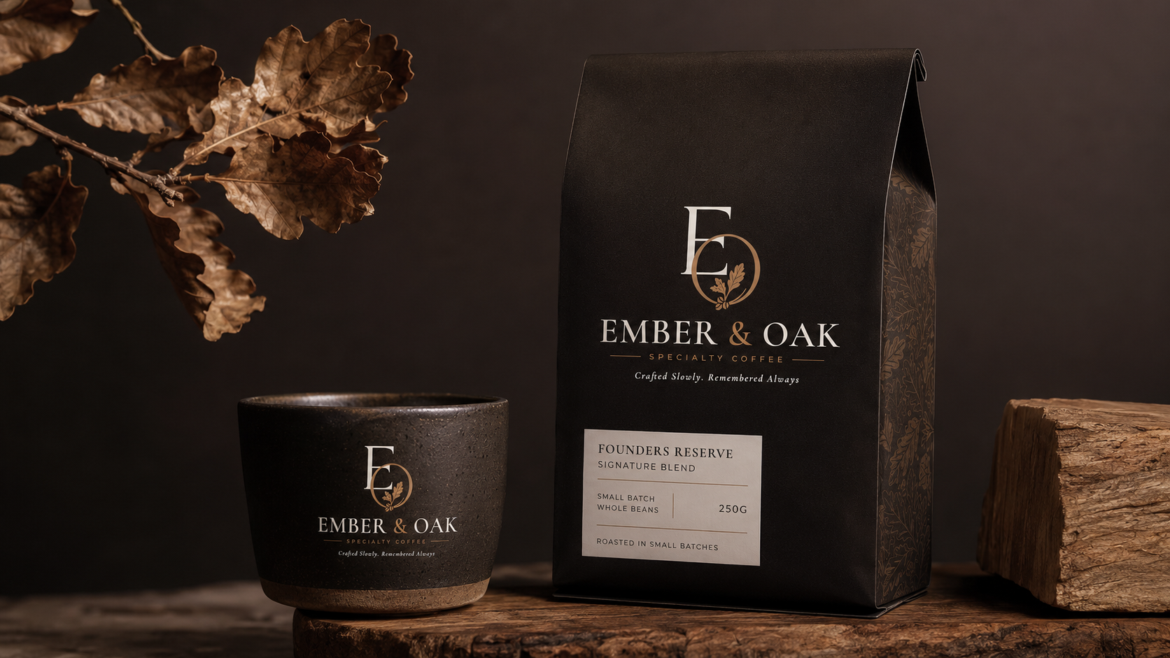
EMBER & OAK
Craftedslowly.
Coffeeworth remembering.
Ember & Oak is a premium coffee brand concept built around the beauty of slow craft, carefully sourced beans and the rituals that make coffee memorable.
The identity combines warm natural tones, refined typography and an editorial visual language to create a brand that feels timeless, tactile and quietly premium.
A mark withcharacter.
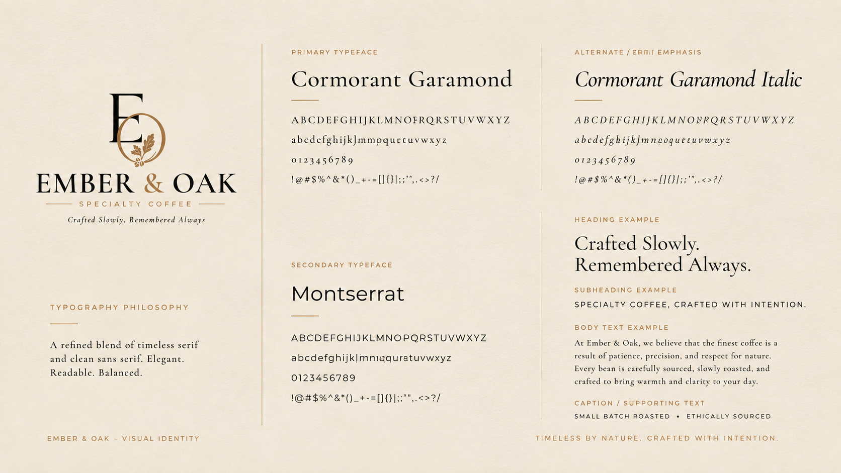
The visual identity was developed to balance heritage and contemporary refinement, giving Ember & Oak a distinctive presence across every touchpoint.
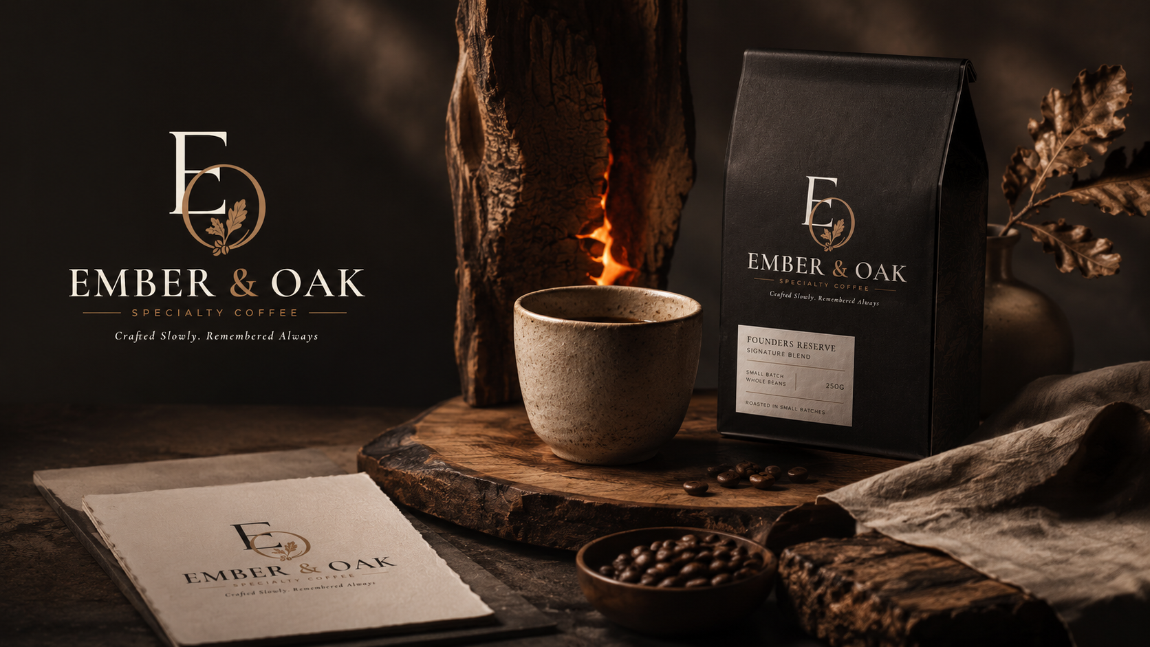
Simple form.Strong memory.
The logo system establishes a flexible signature that remains recognizable across packaging, digital interfaces and physical brand applications.
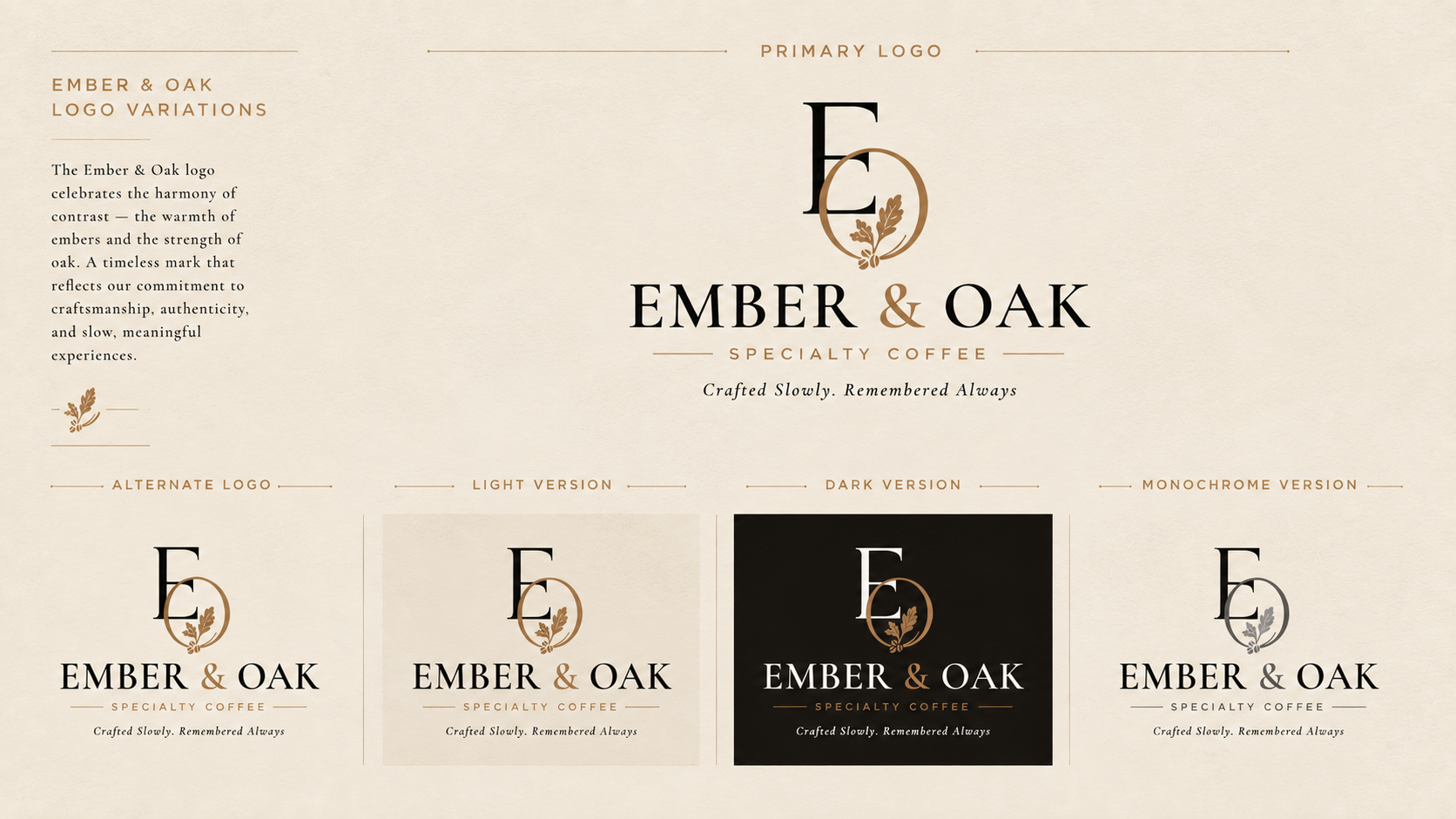
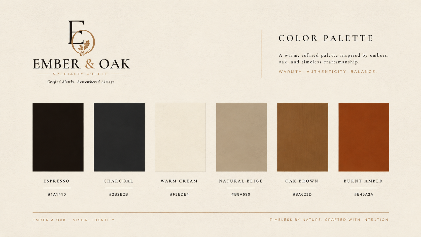
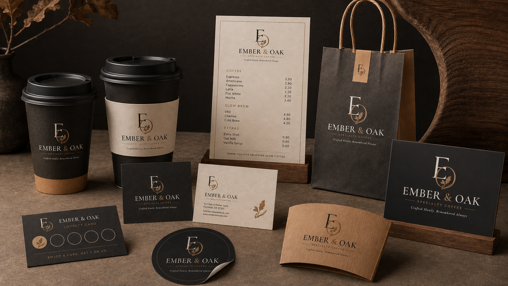
Identityin the real world.
The identity extends beyond the logo into tangible brand moments, creating a cohesive experience wherever the customer encounters Ember & Oak.
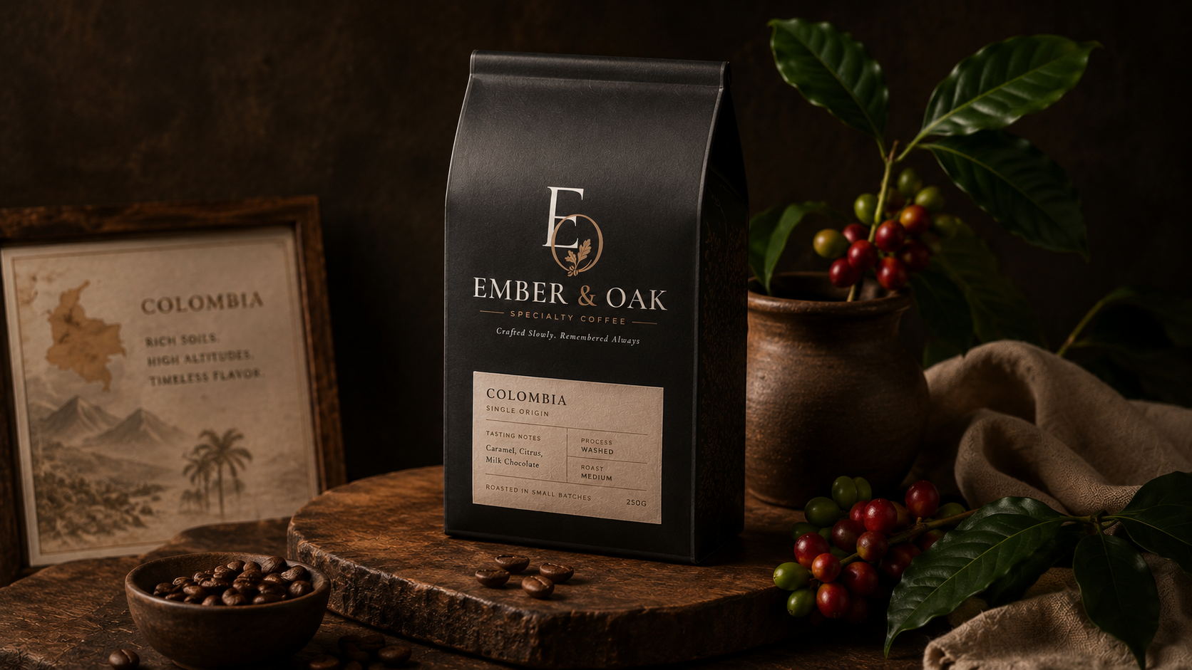
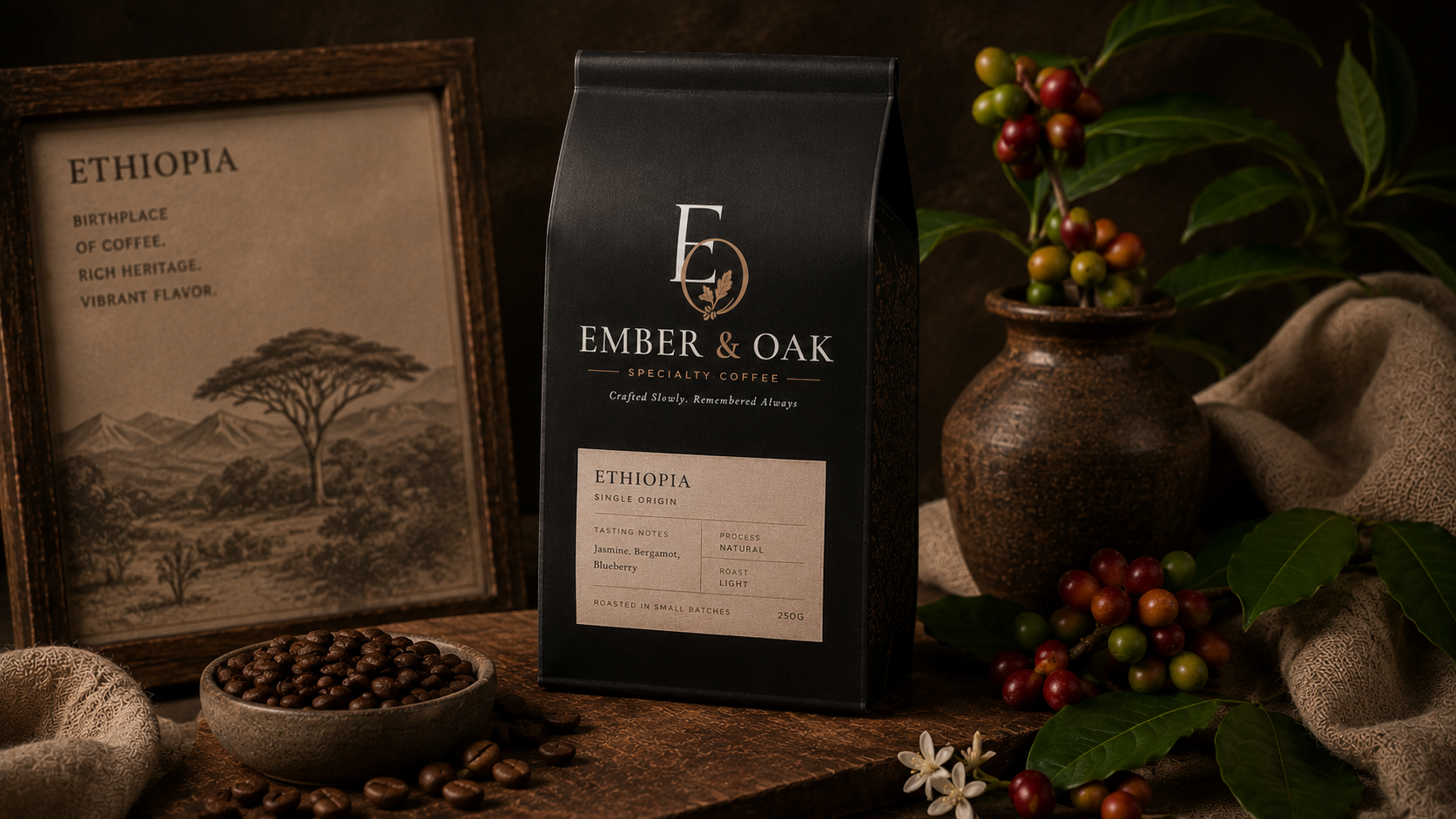
Fromwhere it begins.
Ember & Oak celebrates the journey behind every cup. Origin becomes part of the story, giving each coffee its own character and sense of place.

A place toslow down.
The physical experience follows the same visual philosophy: warm, considered and inviting, turning coffee into a complete sensory experience.
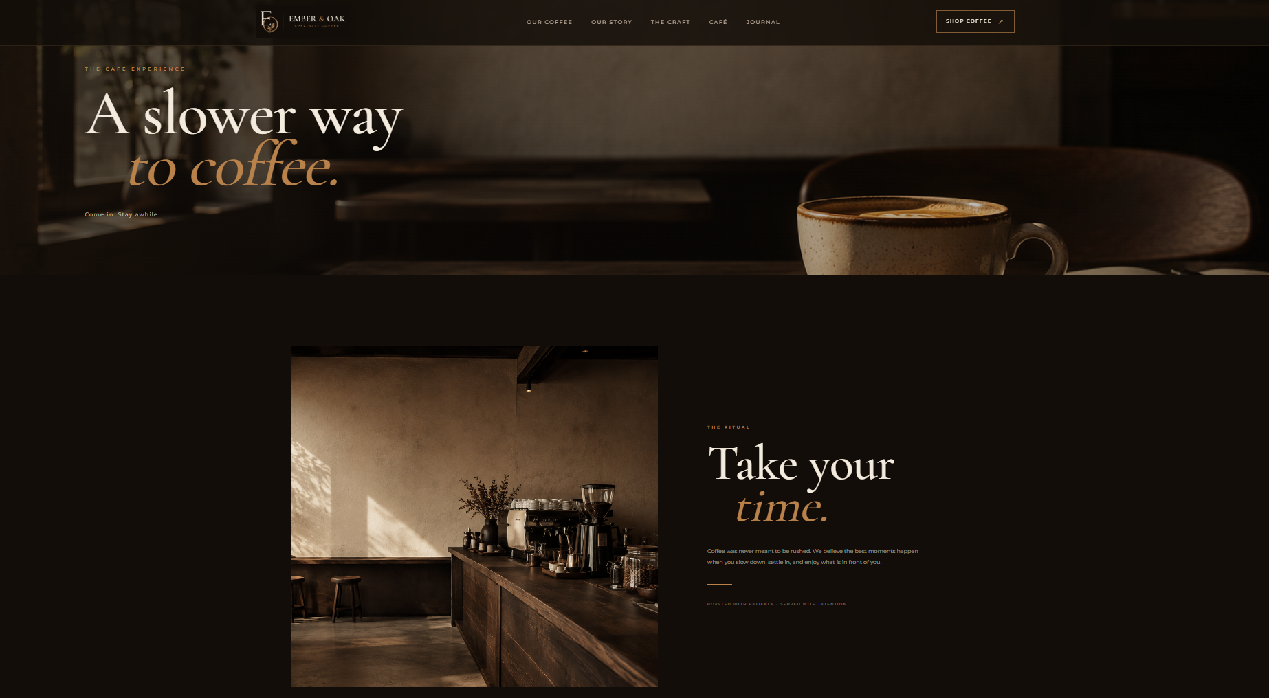
The brandcomes alive.
The digital experience translates the physical identity into an immersive editorial website designed around storytelling, product discovery and brand atmosphere.
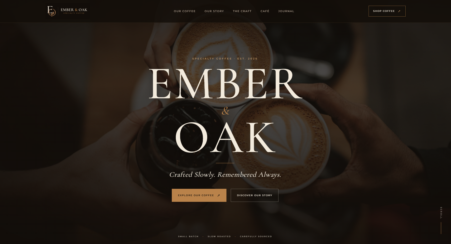
A cinematic opening experience introduces the brand through atmosphere, typography and product storytelling.
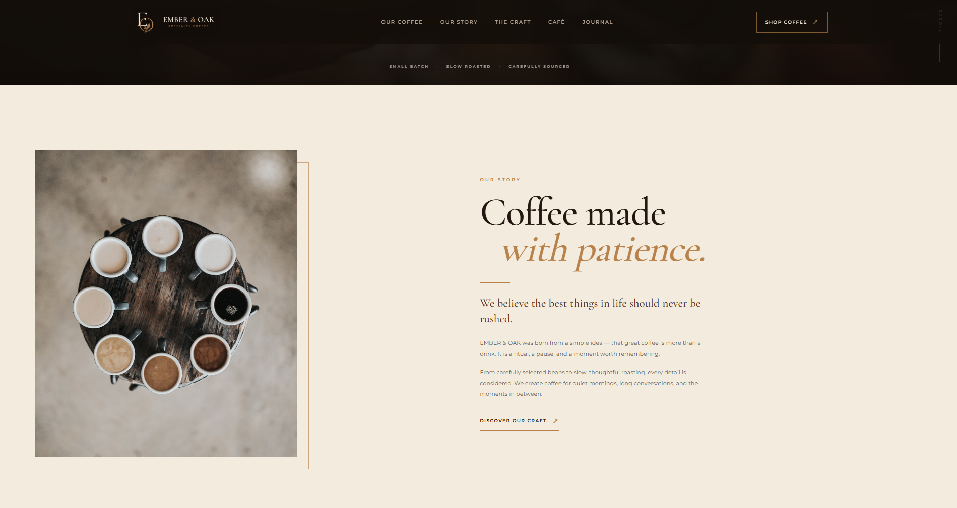
The story section turns the origin and philosophy of Ember & Oak into an editorial digital narrative.
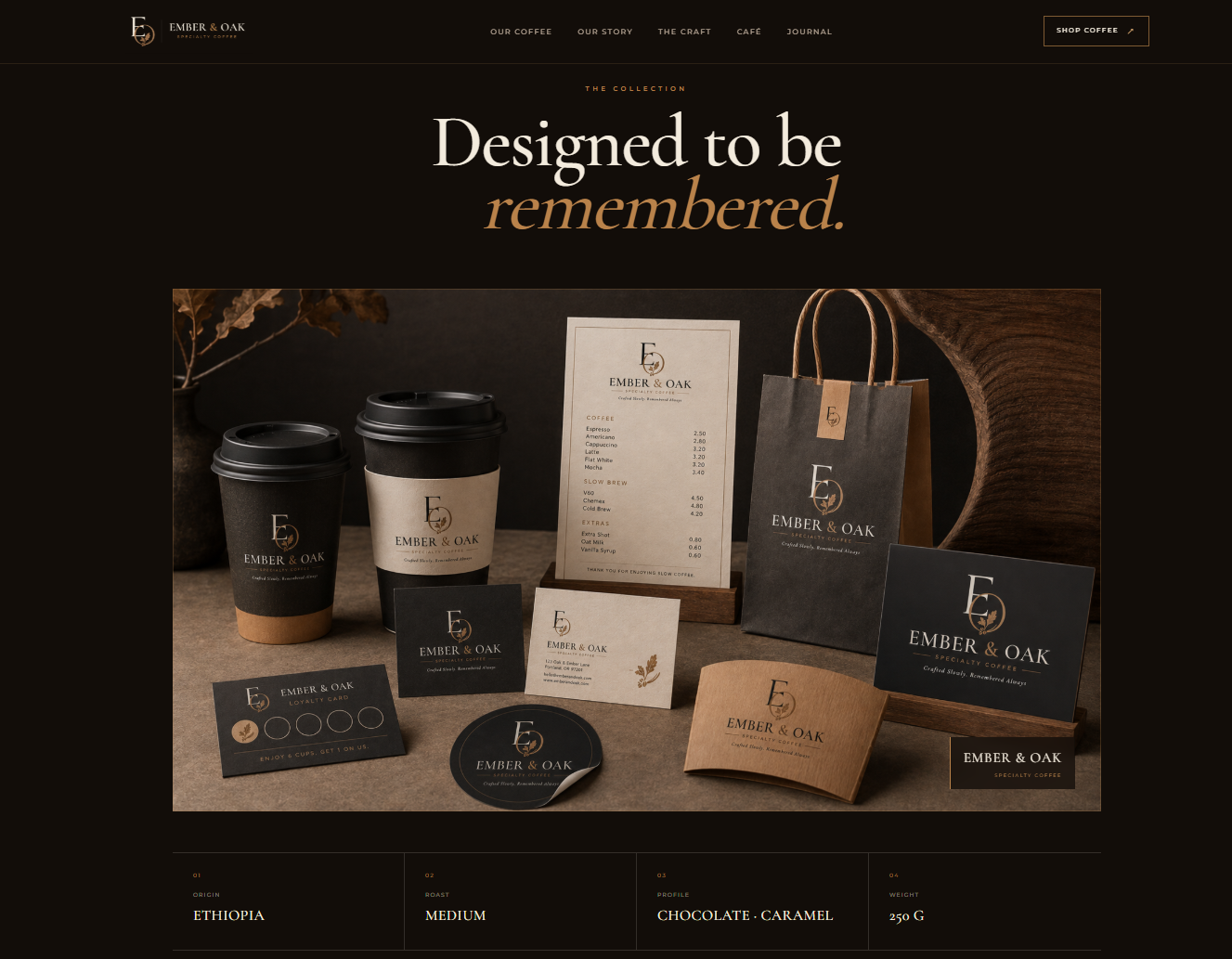
Packaging becomes part of the digital story, connecting product, identity and craftsmanship.
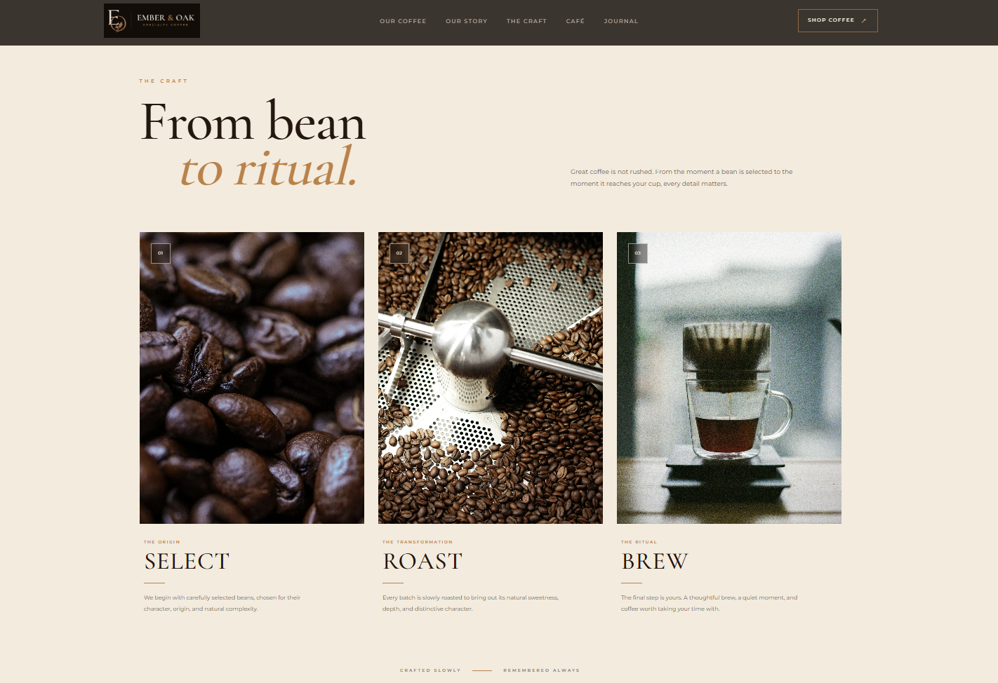
Craftsmanship is presented as a core part of the brand, reinforcing the slow and intentional character of the coffee experience.
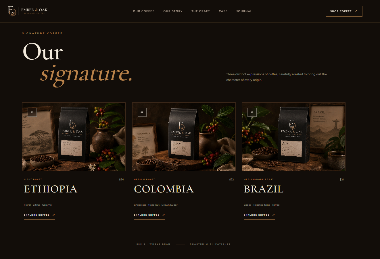
A refined product moment reinforces the premium character of the Ember & Oak experience.
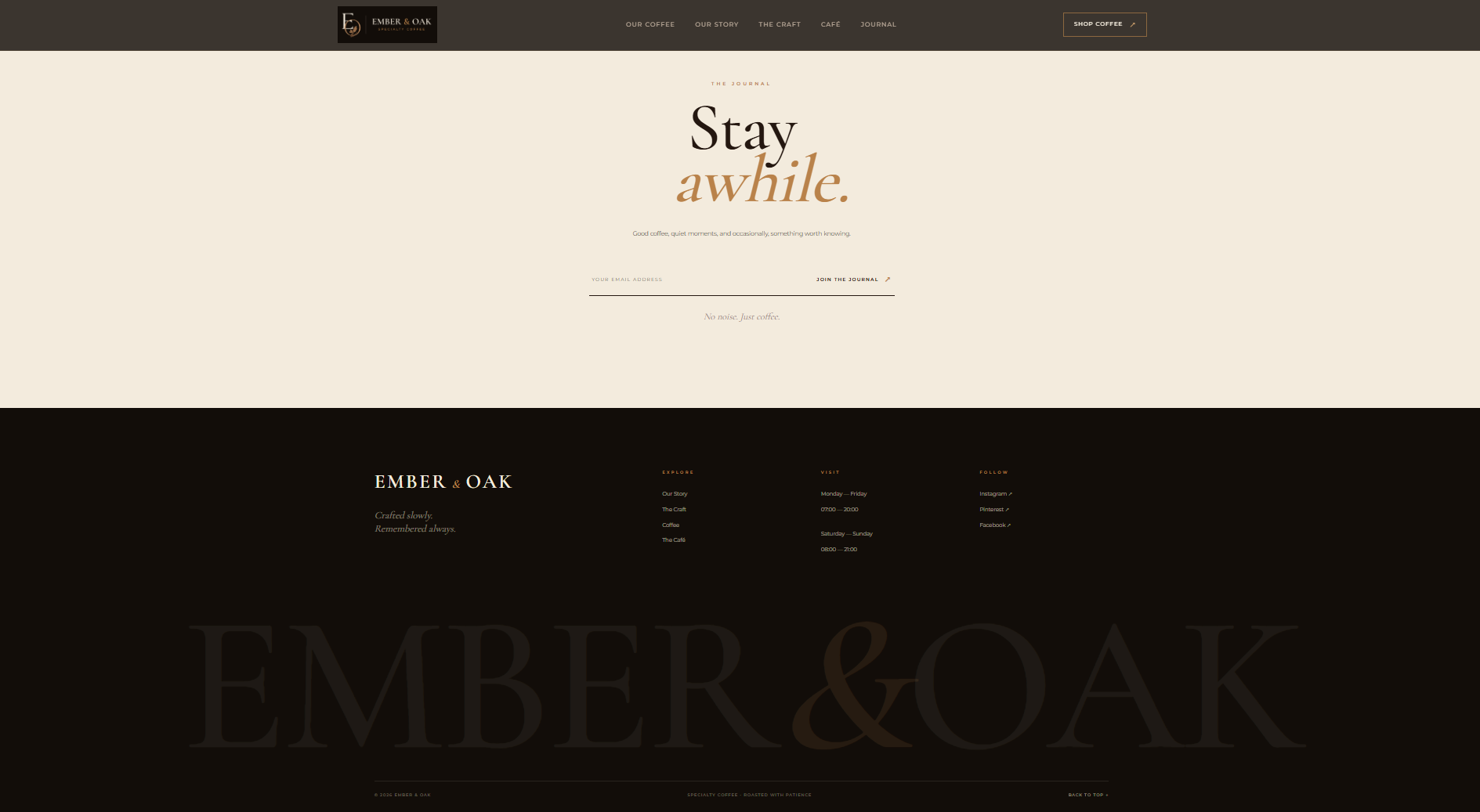
The final interaction keeps the brand experience consistent through a restrained editorial footer.
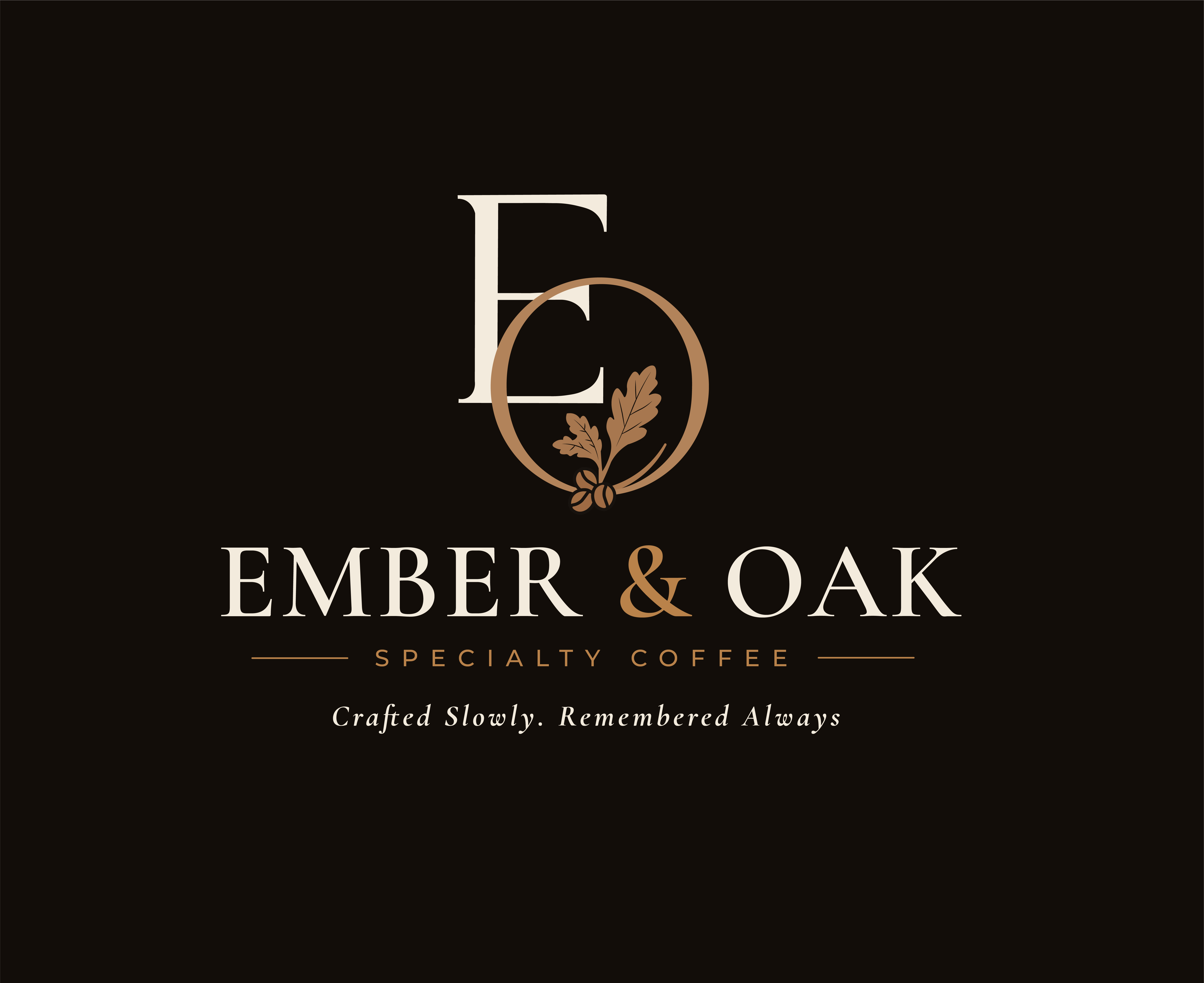
Crafted slowly.Remembered always.
Brand Identity · Packaging · Digital Experience